
I Used Claude to Turn a Messy Spreadsheet Into a Useful Dashboard
How I Used Claude to Turn a Messy Spreadsheet Into a Useful Dashboard
A step-by-step story of cleaning chaotic data and building something my team actually uses
If you've ever inherited a spreadsheet from someone else — or built one yourself over months of "quick edits" — you know the feeling. Tabs with no names. Columns that mean the same thing but are labeled three different ways. Merged cells that break every formula you try to write. A "Notes" column that somehow became load-bearing.
That was me a few weeks ago, staring at a sales tracking spreadsheet that had grown out of control. I decided to try something different: instead of spending a weekend manually untangling it, I handed the mess to Claude and asked it to help me turn it into an actual dashboard I could use. Here's how that went.
The Spreadsheet From Hell
The file in question tracked sales activity across regions, products, and reps. In theory, simple. In practice:
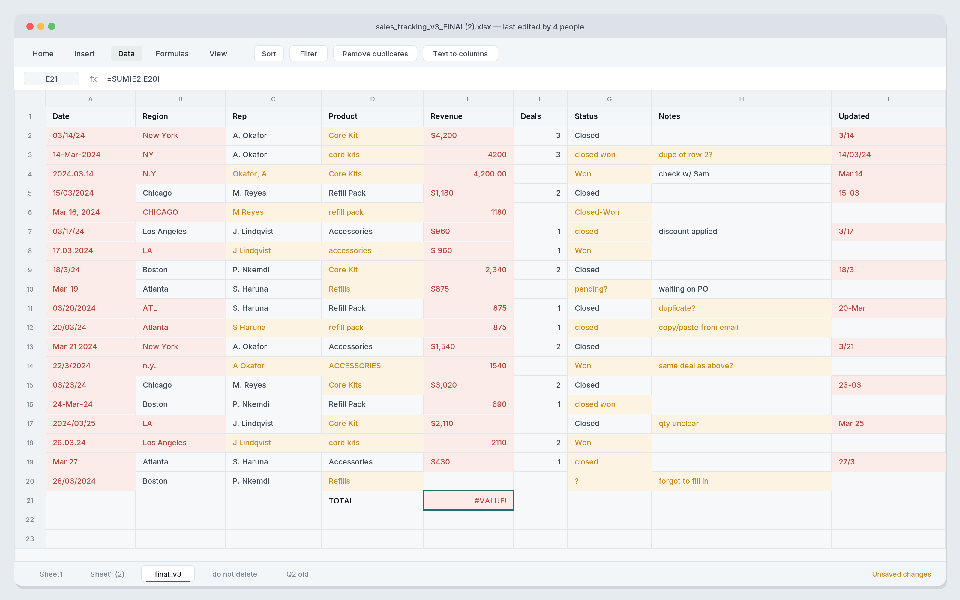
* Dates were stored in at least four different formats
* "New York," "NY," and "N.Y." all showed up as separate regions
* Revenue was sometimes typed as text with a dollar sign, sometimes as a raw number
* There were duplicate rows from copy-pasted updates
* Empty cells were scattered everywhere, with no consistent way of knowing if they meant zero, unknown, or "forgot to fill in"
It wasn't a data problem so much as a communication problem — years of different people touching the same file with different habits.
Why I Turned to Claude Instead of Doing It Manually
I could have cleaned this by hand, but that's hours of tedious find-and-replace work, and it's easy to introduce new mistakes while doing it. What I wanted was something that could look at the whole sheet at once, spot the inconsistencies, ask me questions when something was ambiguous, and actually explain what it was doing — not just silently transform the data and hope for the best.
Step 1: Uploading and Asking It to Make Sense of the Mess
I uploaded the spreadsheet and asked a simple question:
"What's going on in this data, and what would need to happen before it's usable?"
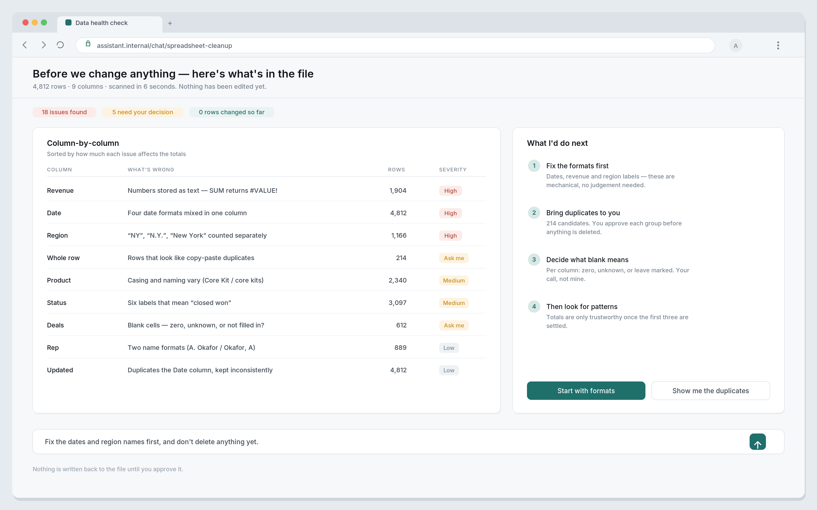
Instead of jumping straight to edits, it gave me a rundown: which columns had inconsistent formatting, where the likely duplicates were, which fields had missing values and roughly how many, and which columns seemed to be tracking the same thing under different names.
That diagnostic pass mattered more than I expected — it turned an overwhelming file into a short, concrete list of problems.
Step 2: Cleaning the Chaos
From there, we went problem by problem:
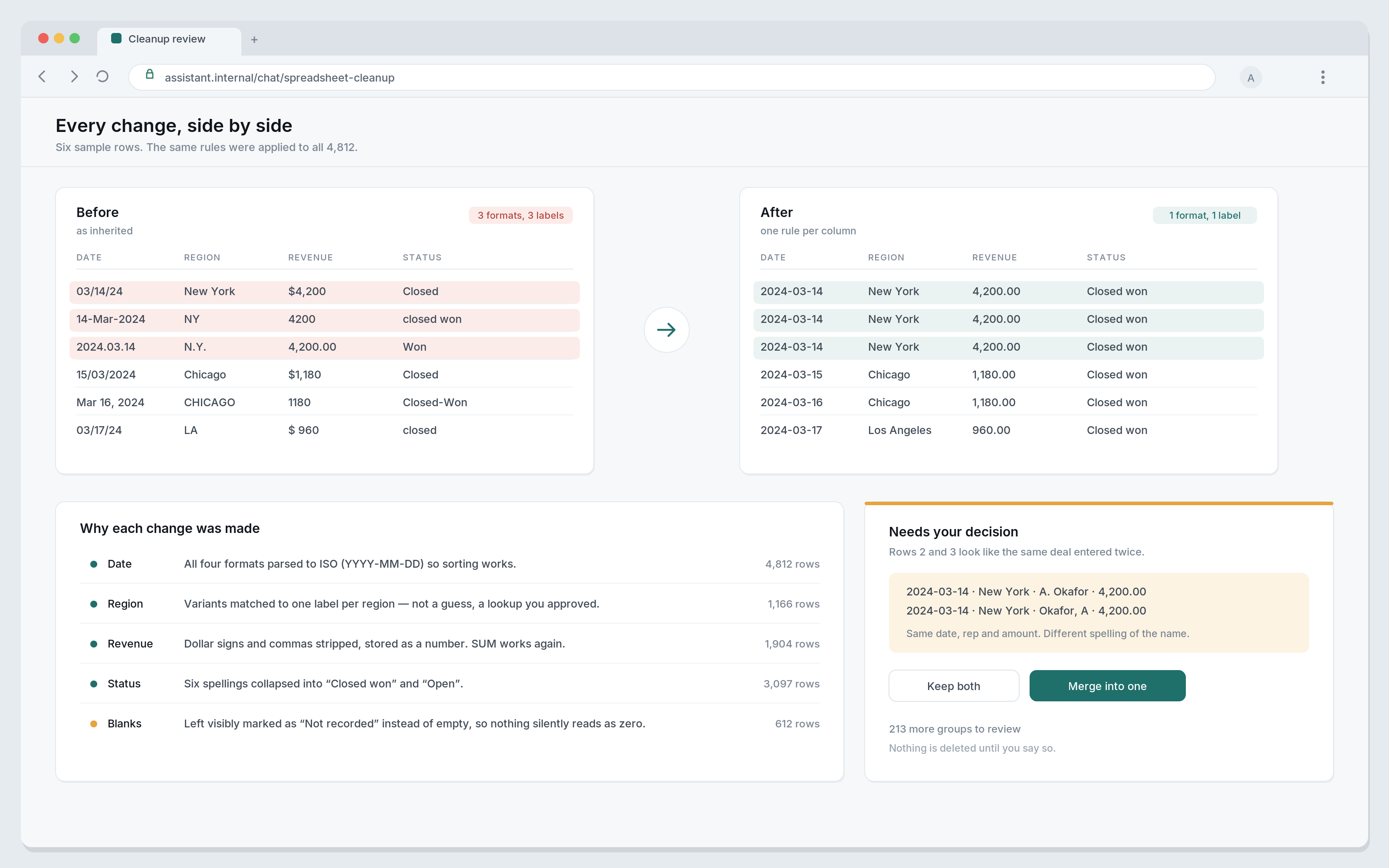
* Standardized every date into one format
* Merged the regional name variants into a single consistent label per region
* Converted all revenue figures into actual numeric values instead of mixed text and numbers
* Flagged duplicate rows for me to confirm before removing them. This part felt important — I didn't want anything deleted without a second pair of eyes, even a digital one.
* Filled in or clearly marked missing values instead of leaving blank cells that would quietly break calculations later
None of this was a black box. At each step, it explained what it was changing and why, which made it easy to catch the one or two places where its assumption about "New York" vs. a typo needed a correction from me.
Step 3: From Clean Data to Real Insights
Clean data is nice, but it's not the goal — understanding is.
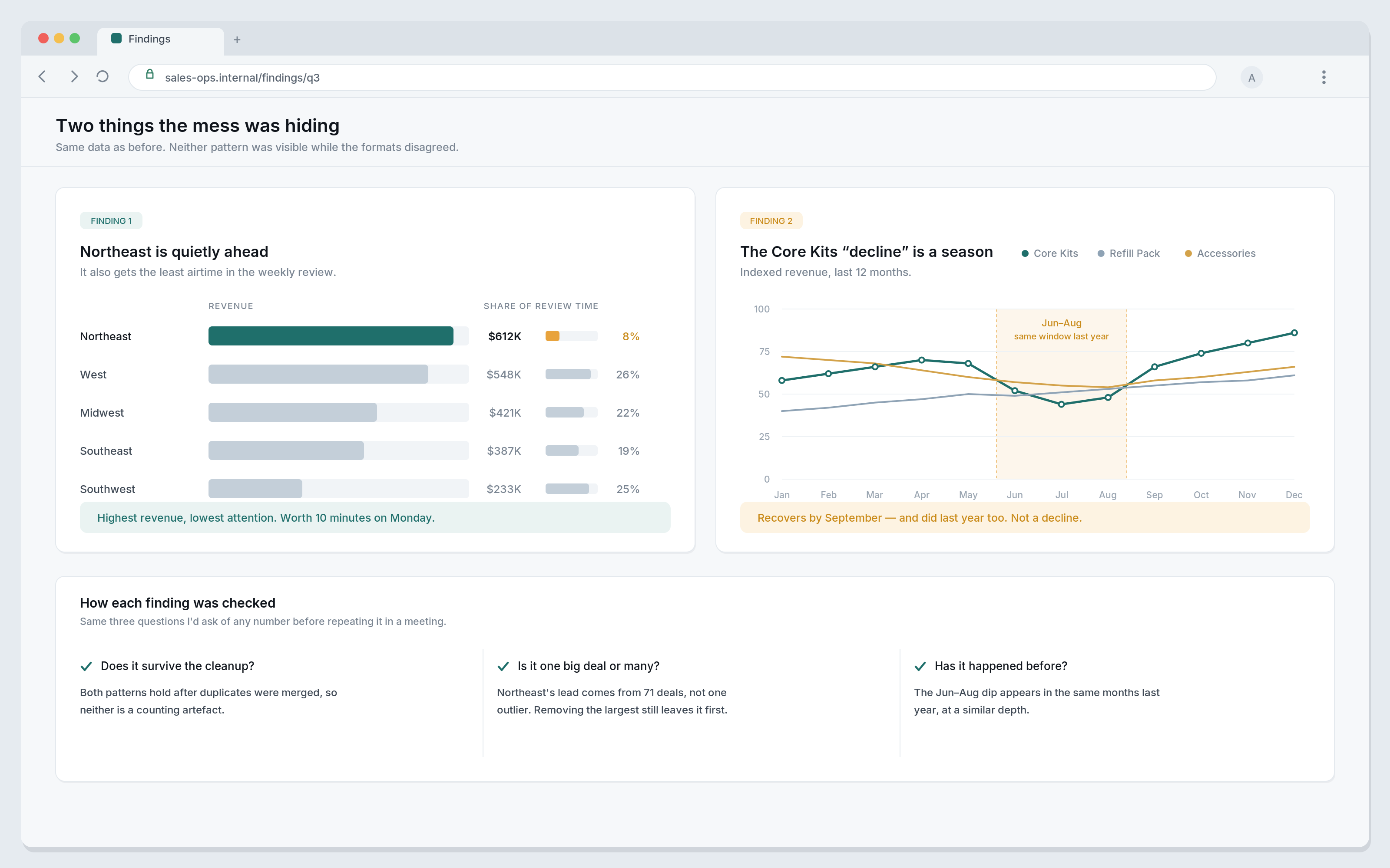
Once the sheet was consistent, I asked what patterns stood out. It pointed out that one region was quietly outperforming the others despite getting the least attention in review meetings, and that a specific product line had a seasonal dip that had been misread internally as an ongoing decline.
Step 5: Iterating Like a Real Analyst
This is the part that made the difference for me.
A first draft of any dashboard is rarely the right one. I asked to swap a bar chart for a trend line, group two product categories together, and highlight the top three reps instead of the top ten.
Each change took a sentence, not a rebuild. It felt less like "using a tool" and more like working with someone who actually understood what I was trying to see.
The Before and After
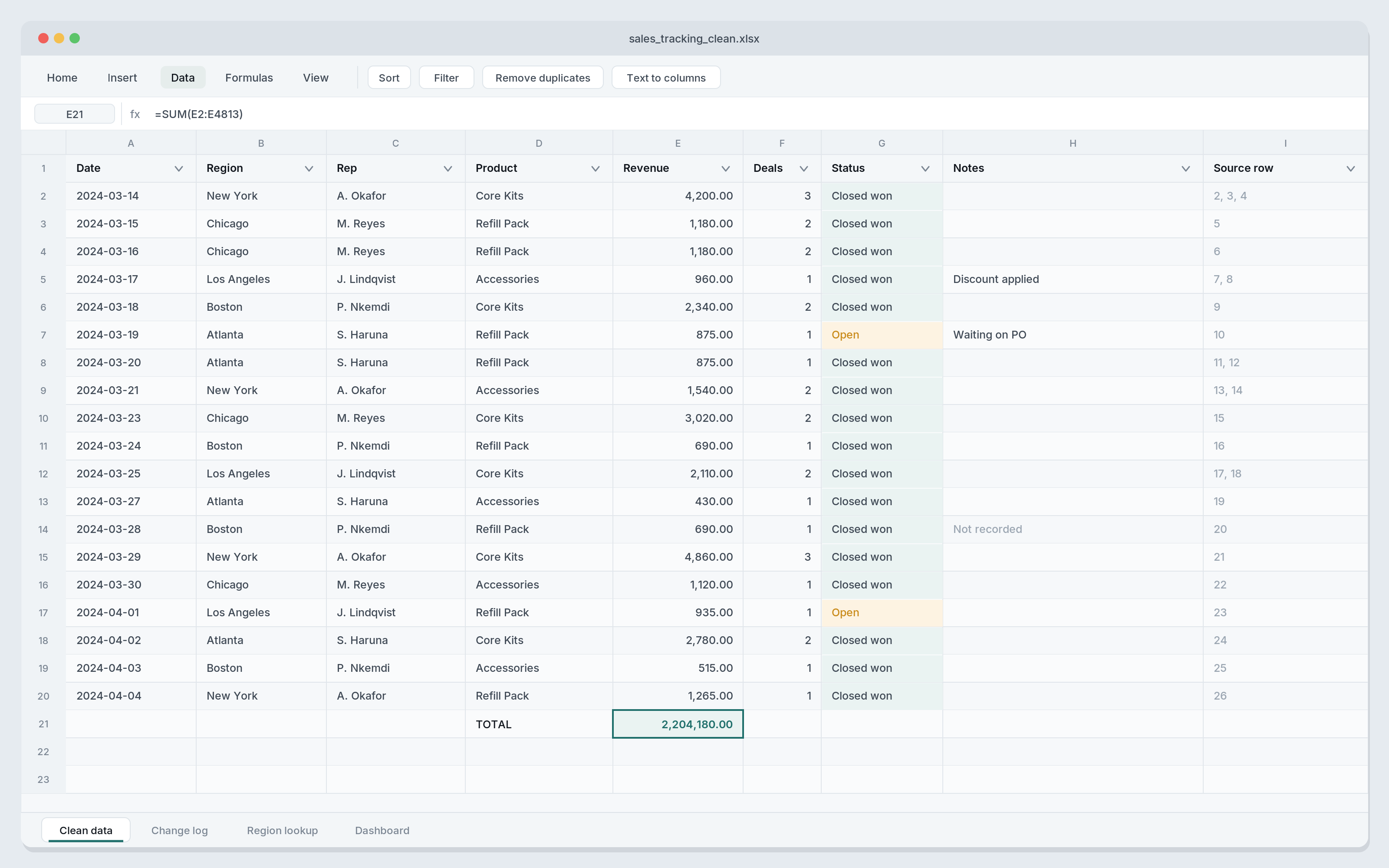
Before: a sprawling, inconsistent spreadsheet that nobody wanted to open, let alone trust.
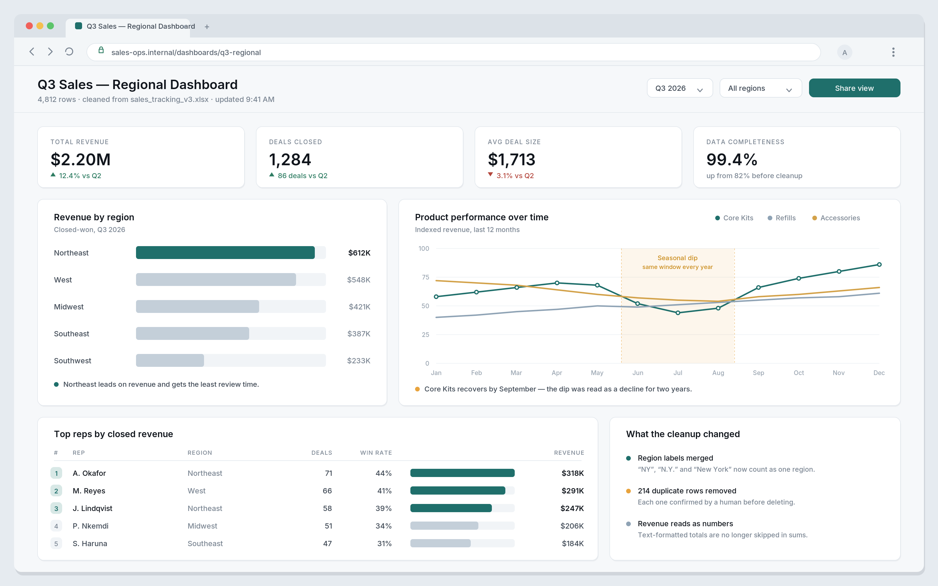
After: a clean dataset and a live dashboard that answered the actual questions my team kept asking in meetings — which regions needed attention, which products needed restocking, and who was actually driving results.
What I Learned
A few things stuck with me from this process:
1. Most "data problems" are really consistency problems.
The information was almost all there — it just wasn't speaking one language.
2. Explaining changes matters as much as making them.
I trusted the cleanup because I could see the reasoning at every step.
3. A dashboard is only useful if it's easy to adjust.
The value wasn't the first version — it was how quickly I could reshape it once I saw it.
4. You don't need to be a data analyst to get analyst-quality output.
I just needed to know what questions I wanted answered.
Final Thoughts
I went into this expecting to spend a weekend untangling formulas and cleaning up formatting by hand. Instead, I spent an afternoon having a conversation about my data — and came out the other side with something my whole team could actually use.
If you've got a spreadsheet sitting in a folder somewhere that you've been dreading opening, that might be worth trying.
